Table of Contents
ToggleChoosing the right office paint colors can make the difference between a workspace that drains you and one that energizes you. Whether you’re setting up a home office for the first time or refreshing an existing one, color isn’t just decoration, it’s psychology at work. Studies consistently show that your environment impacts focus, creativity, and overall job satisfaction. The best office paint colors balance aesthetics with function, and the best home office paint colors depend on what kind of work you do. If you’re stuck staring at beige walls wondering why your motivation tanks by 3 p.m., the answer might be sitting right in front of you: the paint on your walls. This guide covers the top office paint colors that research supports, practical tips for applying them to your space, and colors you should avoid.
Key Takeaways
- Office paint colors directly impact focus, creativity, and job satisfaction—cool blues and greens support analytical work while warm yellows and oranges energize creative tasks.
- The best office paint colors require proper testing: buy a quart sample and observe your chosen color in different lighting conditions (morning, afternoon, artificial) before committing to all four walls.
- Pair office paint colors with the right finish; eggshell or satin finishes reduce glare and screen distractions better than high-gloss, and pair with warm white lighting (3000K) to prevent clinical-looking spaces.
- Avoid highly saturated, neon, or very dark colors on all walls—these overstimulate or create claustrophobia; instead, use dark tones as single accent walls and keep the majority of office paint colors light and restful.
- Neutral grays with warm undertones (like agreeable gray or warm white) create a timeless, professional foundation that lets your work take center stage while preventing the sterile ‘sad cubicle’ effect.
How Paint Color Affects Work Performance
Your brain responds to color in measurable ways. Cool colors like blue and green trigger calming responses, lowering cortisol levels and heart rate. Warm colors like orange and yellow stimulate alertness and energy but can become exhausting if overused. Neutral tones provide stability and reduce visual stress, which matters when you’re spending eight hours in the same room.
The Interaction Design Foundation and multiple workplace psychology studies show that color impacts concentration, creativity, and even decision-making. A blue office environment has been linked to better creative thinking, while green promotes balance and reduces eye strain, critical when you’re working at a screen all day. Your choice should align with your work type: analytical work benefits from cool, focused colors, while creative projects may thrive under warmer, energizing hues.
There’s also the practical side: paint quality and finish matter as much as color. A matte or eggshell finish diffuses light evenly and reduces glare off screens. High-gloss finishes bounce light around and create visual distractions. For a home office, eggshell or satin finishes are your best bet, they’re washable and forgiving without being shiny.
Top Office Paint Colors for Focus and Concentration
If your job demands deep concentration and sustained attention, certain colors work harder for you than others.
Cool Blues and Greens
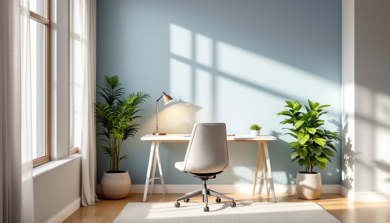
Blue is the productivity champion. It reduces anxiety, supports analytical thinking, and feels calming without being sedative. Softer blues like dusty periwinkle or chambray blue work better than electric or navy shades, which can feel cold or corporate if you’re not careful. A gentle blue-green hybrid (sometimes called teal or sage) offers the focus benefits of blue with the balancing warmth of green.
Green is underrated for home offices. It’s the easiest color on the eyes during long screen sessions, reduces mental fatigue, and creates a sense of renewal. Deep forest greens feel sophisticated and grounded: lighter celadon or soft sage tones work well in smaller spaces. Research from the Journal of Environmental Psychology shows that people working in green environments report lower stress and higher satisfaction.
When painting with these cooler tones, pair them with adequate lighting, daylight or warm white bulbs (3000K color temperature) prevent the space from feeling clinical. If your office gets limited natural light, slightly warmer undertones in your blue or green will keep the room from feeling dungeon-like.
Neutral Tones and Grays
Soft grays, warm whites, and taupe are the backbone of professional home offices. They don’t overstimulate, they’re versatile enough to complement any furniture or artwork, and they create a canvas that lets your work take center stage. Warm grays (those with undertones of beige or brown) feel more inviting than cool grays.
Look for paint names like “agreeable gray,” “accessible beige,” or “urbane bronze” from trusted brands. These aren’t boring, they’re strategic. They also make your space feel larger, which matters in smaller home offices. Grays with warm undertones prevent the “sad cubicle” effect that cold grays can create. Pair them with wood tones, warm metal accents, or accent walls in a complementary color to keep things from feeling sterile. Interior design platforms like Home Bunch showcase how neutral tones form the foundation of rooms that stay timeless and calming.
Colors That Inspire Creativity and Energy
Analytical work demands focus: creative work demands stimulation. If you’re in design, writing, marketing, or any field requiring idea generation, slightly warmer or more saturated colors unlock different parts of your brain.
Soft yellow or golden tones boost mood and mental clarity without overwhelming. Studies show yellow increases optimism and creativity. The key is restraint, pale buttery yellows or warm creams work: bright highlighter yellow will give you a headache. Pair soft yellow with white trim or gray accents to prevent sensory overload.
Burnt orange or rust tones are trending in design-forward home offices. They’re warm, energetic, and feel less corporate than typical warm colors. They pair beautifully with natural wood and work especially well in small office home office colour schemes because they make compact spaces feel intentional rather than cramped. Use them as a full wall or feature wall: balance them with neutral adjoining walls.
Soft blush, mauve, or warm pink tones are gaining traction and work surprisingly well for creative professionals. They’re less aggressive than red but more energizing than beige. These colors feel modern and reduce the stuffiness that can accumulate in dedicated work spaces.
When choosing energizing colors, light to medium saturation is key. Highly saturated or bright versions of these colors become fatiguing. Test paint samples on your wall in different lighting conditions, morning, afternoon, and artificial light. What looks vibrant in the store can feel garish or dull at home. Resources like Addicted 2 Decorating break down specific paint colors and show how lighting transforms them in real rooms.
Colors to Avoid in Your Home Office
Just as certain colors support productivity, others work against it.
Highly saturated or neon colors, hot pink, electric lime, bright orange, overstimulate and exhaust your nervous system. These belong in accent items, not walls. Your eyes have nowhere to rest.
Very dark colors (charcoal, navy, deep burgundy) on all four walls make small offices feel claustrophobic. Dark paint absorbs light, requiring more artificial lighting to compensate, which increases eye strain. If you love a dark tone, use it on one accent wall only and keep other walls light.
Red is polarizing. It raises heart rate and increases alertness, which can shift into anxiety and aggression over time. Avoid pure reds in spaces where you need sustained focus. Rust or burgundy tones, by contrast, are more suitable.
Hospital white or ultra-bright white feels sterile and increases glare, especially under fluorescent or cool artificial light. If you want brightness, opt for warm whites or off-whites with subtle undertones of cream or gray.
Conflicting patterns or multi-color walls pull visual attention everywhere. The best office paint colors are restful enough to fade into the background so your work shines. If you want visual interest, add it through art, plants, or a single accent wall, not by painting competing colors. Experts at House Beautiful emphasize that cohesive color schemes are foundational to functional, beautiful spaces.
Before you paint, buy a quart of your chosen color and paint a large sample on your wall. Live with it for a few days in different lighting. You can’t unsee a color once it’s on all four walls.
Conclusion
The best office paint colors align your environment with your work and temperament. Cool blues and greens support focus: warm yellows and subtle oranges fuel creativity: neutral grays provide versatile balance. Avoid overstimulating or dark colors that trigger fatigue or claustrophobia. Test before committing, and remember that proper lighting and finish matter as much as hue. Your workspace reflects and shapes your productivity, choose thoughtfully.